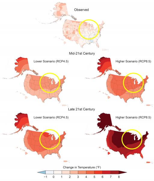
Annual average temperatures across North America are projected to increase, with proportionally greater changes at higher as compared to lower latitudes, and under a higher scenario as compared to a lower one. Click the image for more information and a larger view.
This figure compares (top) observed change for 1986–2016 (relative to 1901–1960 for the contiguous United States and 1925–1960 for Alaska, Hawai‘i, Puerto Rico, and the U.S. Virgin Islands) with projected differences in annual average temperature for mid-century (2036–2065, middle) and end-of-century (2070–2099, bottom) relative to the near-present (1986–2015). Yellow circles added to highlight the Midwest region. Source: adapted from Vose et al. 2017.
Page/s that contain this image:
Last modified:
23 September 2019 - 2:45pm

